Your walls are doing something to you — whether you notice it or not. The color surrounding you right now is raising or lowering your heart rate, influencing how fast you feel tired, and shaping your emotional baseline before you’ve said a word.
This is color psychology. And when it comes to your home, where you spend the majority of your waking and sleeping hours, getting it right matters far more than matching throw pillows.
This guide breaks down exactly how paint colors affect your mood, what the science says about specific hues, and which shades work best in each room — including the variables most paint guides skip entirely.
What Is Color Psychology?
Color psychology is the study of how colors influence human emotion, behavior, and physiological response. It’s not subjective preference or interior design trend-following. It’s neuroscience applied to visual stimuli.
When light hits your eye, different wavelengths trigger different responses in the brain. Short wavelengths (blues, greens) activate the parasympathetic nervous system — your “rest and digest” mode. Long wavelengths (reds, oranges) activate the sympathetic nervous system, increasing heart rate, blood pressure, and alertness.
That response happens in milliseconds. Before you consciously register the room, your brain has already reacted to its dominant color.
Your home is the highest-stakes environment for this effect. Unlike an office or a restaurant — where you spend hours — your home is where you live. A color that subtly elevates stress does that every morning for years.
Warm Colors vs. Cool Colors — The Fundamental Split
Every paint decision starts here.
Warm colors — reds, oranges, yellows, and their blends — activate the nervous system. They increase energy, raise body temperature perception, stimulate appetite, and accelerate the sense of time passing. A room with warm walls feels livelier, more social, and more stimulating. That’s useful in kitchens and living rooms. It’s counterproductive in bedrooms.
Cool colors — blues, greens, purples, and their blends — suppress nervous system activation. They slow breathing, lower perceived temperature, reduce blood pressure, and create a sense of space. Rooms painted in cool tones feel larger, quieter, and more restful.
Neutrals — whites, grays, beiges, taupes — don’t fit neatly into either category, but their undertones do. A beige with pink undertones reads warm. A gray with blue undertones reads cool. The visible color is one thing; the undertone is doing a different job underneath.
Color-by-Color Breakdown: What Each Hue Actually Does
Blue — The Calming Standard
Blue consistently tests as the most calming color worldwide. It’s associated with sky and water — environments the brain reads as open and safe. Physiologically, blue lowers blood pressure, slows heart rate, and supports melatonin production, which is why it performs so well in bedrooms.
Not all blues work the same way. Pale blue and powder blue are calming without feeling cold. Navy is grounding and dramatic — more suitable as an accent. Bright cobalt is stimulating, closer to an energizing color than a restful one.
Best rooms: Bedroom, bathroom, home office
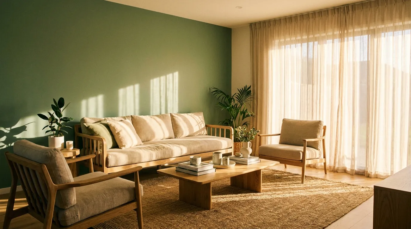
Green — Balance and Biophilic Restoration
Green sits at the center of the visible spectrum. Your eyes require zero adjustment to process it, which is why it feels immediately easy and natural. It’s the color most directly connected to the biophilic response — the innate human affinity for nature.
Research shows exposure to green environments reduces cortisol levels. Inside the home, green walls replicate that effect to a measurable degree. Sage green and muted olive tones are particularly effective because they carry the earthy quality of natural foliage rather than the synthetic brightness of artificial greens.
Lighter greens like mint feel fresh and clean. Deeper greens like hunter or forest green feel grounded and library-like — excellent for a study or living room.
Best rooms: Bedroom, living room, home office
Yellow — Optimism With a Threshold
Yellow triggers the release of serotonin. It’s the color most associated with cheerfulness, optimism, and morning energy. In the right application — pale butter yellow, warm cream, soft maize — it brightens a space without overwhelming it.
The problem with yellow is dose sensitivity. Saturated, intense yellows activate the nervous system aggressively. Rooms painted in bright yellow can trigger irritability and eye fatigue over extended periods. Babies cry more in yellow rooms; this is documented.
Stick to soft, warm yellows in living areas and kitchens. Avoid high-saturation yellows on full walls.
Best rooms: Kitchen, hallway, dining room
Red — Energy, Appetite, and Aggression Risk
Red is the most physiologically intense color. It stimulates the sympathetic nervous system directly — increasing heart rate, raising blood pressure, and releasing adrenaline. That creates energy, passion, and urgency, which is why it works in gyms and social spaces.
In the home, red is best used in small doses. A red dining room can make meals feel more lively and appetizing. A red home office tends to raise stress over time. A red bedroom is generally a poor sleep environment.
Terracotta and deep rust are more livable forms of red-family colors — they carry the warmth without the same physiological intensity.
Best rooms: Dining room, kitchen accents, gym or workout space
Orange — Social Warmth Without the Intensity
Orange combines red’s energy with yellow’s optimism, but at a lower physiological activation level than pure red. It’s one of the most socially stimulating colors — linked to enthusiasm, warmth, and a welcoming atmosphere.
Burnt orange and terracotta are current design-forward versions of this color and read more sophisticated than bright orange. They work particularly well in living rooms and kitchens where you want energy without tension.
Best rooms: Living room, kitchen, dining room
Purple and Lavender — Calm Creativity
Lavender and soft purple blend the calm of blue with just enough red-family warmth to prevent coldness. Lavender specifically has been shown to reduce anxiety and lower heart rate in clinical settings.
Deeper purples carry a sense of luxury and mystery. Used as an accent or in a reading room, they create an introspective atmosphere. Avoid saturated purple on large walls — it can feel heavy and disorienting over time.
Best rooms: Bedroom, bathroom, reading nook
White and Neutrals — Clarity vs. Sterility
White is not neutral in its psychological effect. Bright, cool white creates a clinical feeling — clean but uncomfortable for extended living. Warm whites (cream, alabaster, off-white) feel calm and open without the sterility.
Beige, greige, and warm taupe draw on the psychology of brown: stability, safety, and comfort. They’re excellent base colors that allow accent colors to do the emotional work. As a standalone palette, they risk feeling flat if not supported with texture and layering.
Best rooms: Anywhere — but undertone matters enormously (more on that below)
Gray — Sophistication or Emotional Flatness
Gray is a risk. In natural light, mid-tone grays can read as sophisticated and calm. In dark or north-facing rooms, the same gray can feel oppressive and emotionally draining. Gray rooms require strong lighting strategy to work well.
Warm grays with brown or greige undertones are more livable than cool blue-gray tones, especially in bedrooms and living rooms.
Room-by-Room Paint Psychology Guide
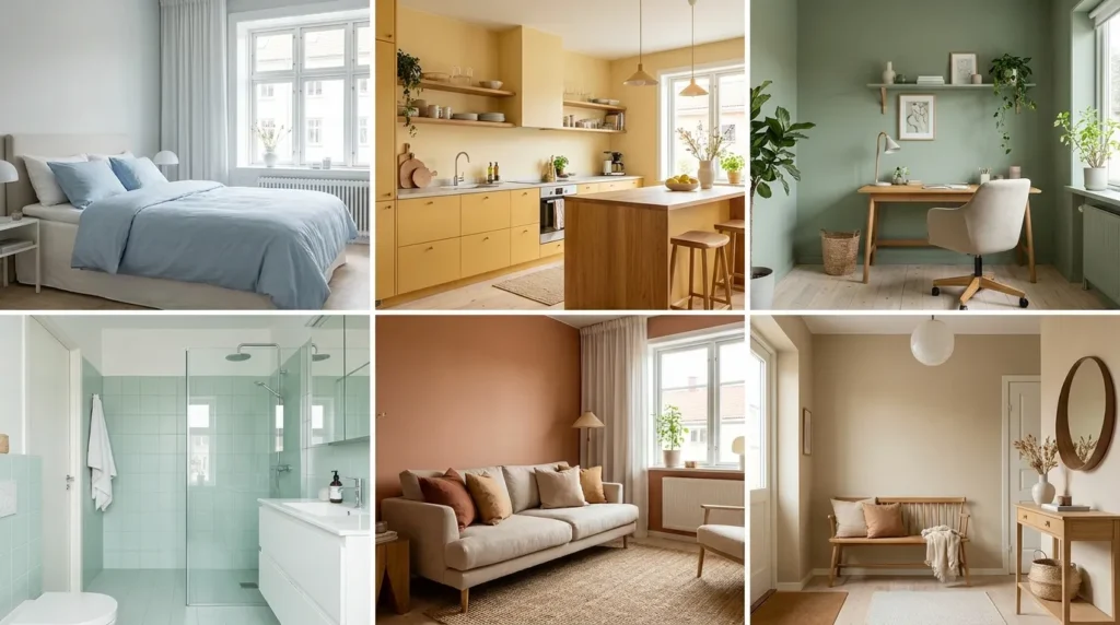
Bedroom — Prioritize Sleep and Recovery
The bedroom’s primary job is rest and recovery. Every color decision here should support that function.
Soft blue, sage green, lavender, and warm white are the strongest performers. They lower nervous system activation, support melatonin production, and reduce the mental noise that makes it hard to wind down.
Avoid bright warm colors on full walls. If you love terracotta or warm yellow, keep them to small accents or textiles — not the dominant surface color.
Specific shades that perform well: Sherwin-Williams Sea Salt (SW 6204) for a soft green-blue, Benjamin Moore Misty Lilac for a calming purple-gray, and any warm white with yellow or pink undertones rather than cool blue ones.
Living Room — Conversation and Connection
The living room needs to support multiple modes: relaxing alone, hosting guests, family time. That’s a wider emotional range than most rooms.
Medium-warm tones — terracotta, sage, warm taupe, dusty blue — handle this best. They’re social without being overstimulating. Avoid colors that push too far in either direction: pure white feels too formal, bright red feels too intense.
For a statement approach, a single accent wall in a deeper hue lets you add color psychology impact without committing full walls to a bold shade.
Kitchen — Appetite, Energy, and Morning Mood
Kitchens benefit from colors that stimulate appetite and morning energy. Soft yellows, warm whites, terracotta, and sage green all work well here.
If you’re painting kitchen cabinets rather than walls, the psychology still applies but at lower intensity — painting kitchen cabinets in a warm cream or sage can completely shift the room’s emotional tone without touching a wall.
Avoid gray in kitchens. It reads as cold and antiseptic in a room that should feel warm and nourishing.
Home Office — Focus Without Mental Fatigue
For sustained focus, blue-greens and muted sage greens outperform every other color family. They’re calm enough to prevent distraction but carry enough visual stimulation to maintain alertness.
Pale yellow works for creative work but becomes tiring during long sessions. Pure white causes glare fatigue. Red raises stress levels — measurably counterproductive for focus work.
If you’re setting up a functional home workspace, color is one input — organizing your home office for productivity starts with the physical layout, but paint color is the psychological baseline that everything else sits on top of.
Bathroom — Restoration and Reset
Bathrooms are short-duration rooms where the experience should feel restorative. Pale blues, soft greens, warm whites, and light lavender all create a spa-like quality.
Avoid bold warm colors unless the bathroom is very well-lit. In small, poorly-lit bathrooms, warm saturated tones make the space feel smaller and more enclosed.
Hallways and Entryways — First Impressions Set the Tone
The entryway is where you transition from outside stress to home. It’s also where visitors form their first impression of your space.
Warm, welcoming neutrals — warm white, soft taupe, light terracotta — set a hospitable tone without demanding attention. Darker accent colors on an entryway wall can create drama and intentionality, signaling that the interior has personality.
What Most Paint Guides Miss
Saturation: The Variable That Changes Everything
Choosing “blue” for a bedroom is only the beginning. A pale, low-saturation blue is calming. A medium-saturation blue is balanced. A high-saturation cobalt is stimulating and energizing — the opposite effect of what most people want in a bedroom.
Saturation determines arousal level more than hue does in many cases. When a color feels “off” in a room despite being theoretically correct, saturation is usually the culprit.
Rule of thumb: For restful rooms (bedroom, bathroom), keep saturation below 40%. For active rooms (kitchen, gym), higher saturation is appropriate.
Undertones: The Hidden Layer
Every paint color has an undertone — a secondary color that influences how the primary color reads. A “white” paint can have blue, pink, green, or yellow undertones. Under different lighting conditions, that undertone becomes visible and changes the entire room’s feeling.
The practical test: hold your paint swatch against a pure white sheet of paper. The undertone becomes immediately visible. A warm-undertone white will look slightly yellow or pink. A cool-undertone white will look faintly blue or gray.
Matching paint colors to your furniture requires understanding undertones — a “white” wall with cool blue undertones will clash visually with warm wood tones even when both seem neutral.
Room Orientation and Natural Light
The direction your room faces determines the quality of natural light, which determines how every paint color actually looks at different times of day.
- North-facing rooms receive cool, indirect light. Warm paint tones compensate — cool grays will read as bleak.
- South-facing rooms get warm, direct light all day. They can handle cooler tones without feeling cold.
- East-facing rooms are warm in the morning, cool in the afternoon. Test swatches at both times.
- West-facing rooms are cool in the morning, warm in the evening. Deep warm colors here can become very intense at sunset.
Paint Finish and Its Psychological Effect
Finish is rarely discussed in color psychology guides, but it has a direct psychological impact. For a detailed breakdown, the paint finish guide for every room covers this in full — but here’s the core principle:
Matte finish absorbs light. It makes colors feel softer, more diffuse, and more calming. Better for bedrooms, living rooms, and any room where restfulness is the goal.
Eggshell and satin reflect a small amount of light. Colors appear slightly more saturated and the room feels slightly more active. Good for kitchens and bathrooms.
Gloss and semi-gloss reflect significantly. They make colors appear brighter and more stimulating. Appropriate for trim and cabinets; rarely ideal for full walls in living areas.
The same shade of blue in matte will feel noticeably more calming than the same shade in satin. This is not a small difference.
How to Test a Color Before Committing
Never choose a paint color from a small chip under store lighting. Here’s a practical three-step protocol:
Step 1: Buy sample pots of your top 2–3 colors. Paint 12×12 inch swatches directly on the wall — not on cardboard. The interaction with your actual wall surface changes the appearance.
Step 2: Observe the swatch at three different times: morning, midday, and evening under artificial light. Colors shift significantly between these conditions.
Step 3: Live with it for 48 hours before buying full quantities. Emotional response changes after extended exposure.
Before you buy, use the paint coverage calculator to estimate how much paint you’ll need for each room — it prevents over- or under-buying and is especially useful when testing multiple colors.
If you’re considering eco-friendly paint options, low-VOC and zero-VOC formulas are now available across the full color spectrum without any color limitation.
Frequently Asked Questions
What is the most calming paint color for a bedroom? Soft blue is consistently rated the most calming color in controlled studies. It lowers heart rate and blood pressure while supporting melatonin production. Pale, low-saturation shades — powder blue, misty blue, or soft teal — perform better than bright or highly saturated blues.
Can paint color actually affect sleep quality? Yes. High-stimulation colors (bright red, orange, saturated yellow) keep the nervous system more active, which makes it harder to wind down. Cool, muted tones reduce nervous system activation and are associated with faster sleep onset and lower nighttime cortisol levels.
What color is best for a home office? Blue-green and muted sage green produce the best combination of calm and focus. They prevent distraction without inducing drowsiness. Avoid pure white (glare fatigue) and red (elevated stress response).
Does warm white or cool white make a room feel bigger? Both expand perceived space, but cool whites with blue or gray undertones make rooms feel more open and airy. Warm whites make rooms feel cozy and welcoming. The “right” choice depends on whether you prioritize spaciousness or warmth.
How much does saturation level matter compared to color choice? Significantly. A low-saturation warm yellow and a high-saturation warm yellow produce opposite emotional effects despite being the same hue family. In restful rooms, always choose low-to-mid saturation regardless of the color you select.
What colors should you avoid in a kitchen? Gray reads cold and antiseptic in kitchens. Pure, bright red on full walls becomes aggressive over time. Very dark colors make food preparation areas feel enclosed and dim. Warm whites, soft yellows, sage green, and terracotta are the strongest performers.
Final Thought
Paint is the single highest-impact-per-dollar change you can make to any room. A can of paint costs less than a lamp and changes more. But the color has to be chosen for how it functions, not just how it looks.
Start with the room’s purpose. Match the color family to that purpose. Then refine on saturation, undertone, and finish. Test before committing. The difference between a room that drains you and one that restores you is often nothing more than the right shade on the right wall.


Leave a Reply