
Colors do more than make your home look pretty. They actually change how you feel, think, and act in each room. Understanding color psychology can help you create spaces that boost your mood, improve sleep, and make daily activities more enjoyable.
Research shows that different colors trigger specific emotional and physical responses. Scientific studies have shown that certain colors can trigger physiological and psychological responses. By carefully choosing hues for a space, designers can create specific emotional responses that set the tone for the entire room.
This guide explains how colors affect your mind and body, plus gives you practical tips for choosing the right colors for every room in your home.
How Color Psychology Works in Interior Design
Color psychology studies how different hues affect human behavior and emotions. Warm hues can create a sense of energy and excitement, while cool tones promote calmness and relaxation.
Your brain processes colors and connects them to memories, feelings, and physical responses. This happens automatically, whether you notice it or not.
The Science Behind Color and Emotion
When light enters your eyes, it sends signals to your brain that affect:
- Heart rate and blood pressure
- Hormone production
- Sleep patterns
- Appetite levels
- Focus and concentration
However it also raises blood pressure, heart rate and respiration when discussing red’s effects on the body.
Warm vs. Cool Colors
Warm Colors (reds, oranges, yellows):
- Create energy and excitement
- Make spaces feel cozy and intimate
- Stimulate conversation and appetite
- Can make rooms feel smaller
Cool Colors (blues, greens, purples):
- Promote relaxation and calm
- Help with focus and concentration
- Make spaces feel larger and more open
- Support better sleep quality
Also Read: 25+ Stunning Accent Wall Ideas That Transform Any Room Fast
Best Colors for Each Room
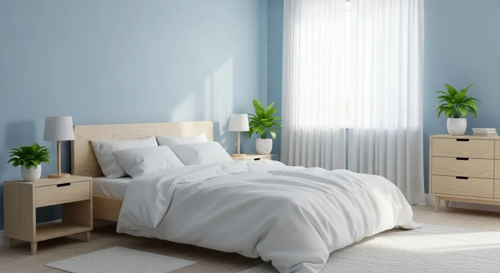
Bedroom Colors for Better Sleep
Your bedroom color directly affects sleep quality. Research reveals that certain colors, such as blue and green, tend to promote more positive emotions and associations.
Top Calming Bedroom Colors:
Blue: Soft blue, with its gentle and soothing tone, is renowned for its ability to evoke a sense of calmness and tranquility in a bedroom environment. Blue lowers heart rate and reduces anxiety.
Green: Connects you with nature and promotes healing. Light sage or mint green work best for bedrooms.
Soft Gray: Creates a peaceful, neutral backdrop that works with any decor style.
Warm Beige: Tan is a neutral tone that helps to put the mind at ease and makes you feel comfortable, which can help you to get a restful sleep.
Colors to Avoid in Bedrooms:
- Bright red (too stimulating)
- Vibrant orange (increases energy)
- Bright yellow (can cause restlessness)
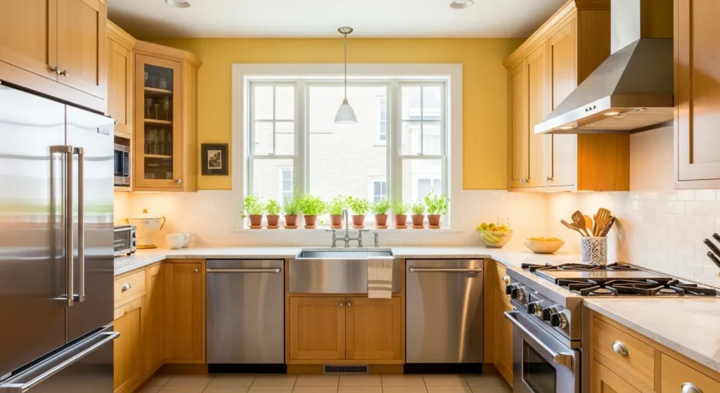
Kitchen Colors That Boost Appetite
Kitchen colors should encourage cooking and eating while creating a welcoming atmosphere for family gatherings.
Best Kitchen Color Choices:
Warm Yellow: Yellow is a good color for the kitchen because it’s cheerful, energizes and creates a sunny, welcoming feel.
Soft Red Accents: It stimulates the appetite and conversation which makes red a great color for dining rooms and kitchens. Use red in small doses through accessories or a feature wall.
Warm White: Creates a clean, spacious feeling while maintaining warmth.
Earth Tones: Think about using lighter tones of yellow or subdued terracotta for a cozy and welcoming atmosphere.
Kitchen Colors to Use Carefully:
- Blue (can suppress appetite)
- Purple (may make food look unappetizing)
- Dark colors (can make the space feel cramped)
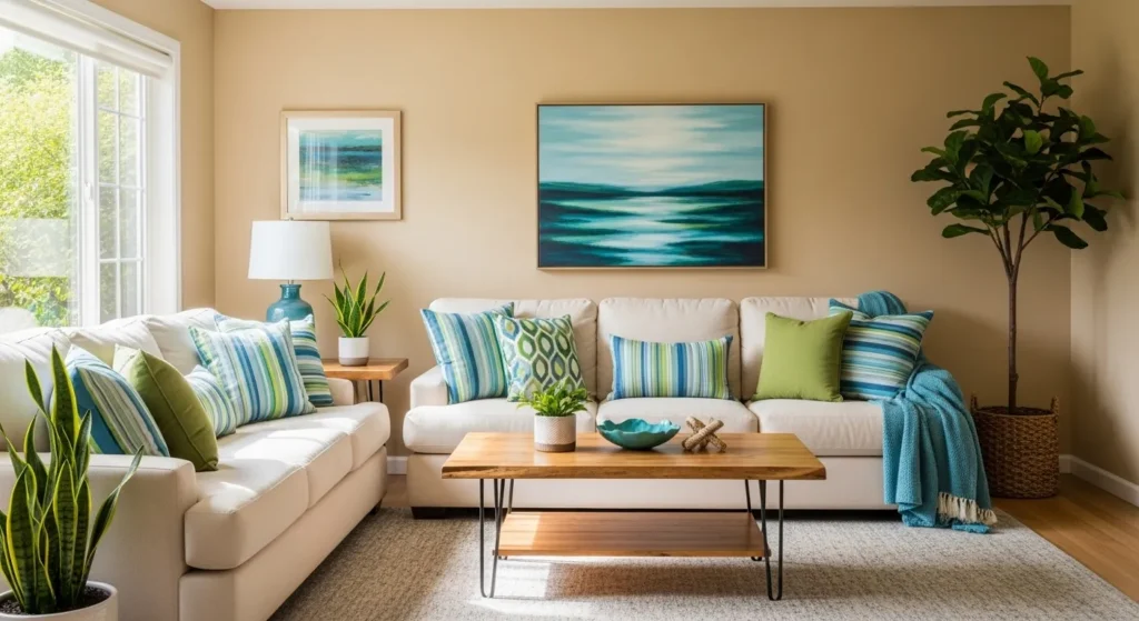
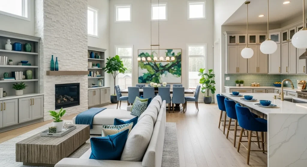
Living Room Colors for Socializing
Living rooms need colors that encourage conversation and relaxation while reflecting your personality.
Perfect Living Room Colors:
Warm Neutrals: Beige, cream, and soft taupe create a comfortable foundation for any decor style.
Soft Blues: Promote calm conversation and relaxation after busy days.
Sage Green: Connects your space with nature and creates a peaceful atmosphere.
Accent Walls: In the living room, it can be used via wall décor or accessories to raise the energy levels of conversation when discussing red accents.
Bathroom Colors for Relaxation
Bathrooms should feel clean, fresh, and spa-like to start and end your day peacefully.
Ideal Bathroom Colors:
Soft Blues: Create a spa-like, peaceful atmosphere perfect for unwinding.
Clean Whites: Make small bathrooms feel larger and more open.
Pale Greens: Connect with nature and promote healing and renewal.
Light Grays: Provide a modern, sophisticated backdrop that’s easy to decorate.
Dining Room Colors for Gathering
Dining rooms benefit from colors that stimulate appetite and encourage family bonding.
Great Dining Room Options:
Warm Red: Red also inspires appetite, so it’s a logical choice for your dining room or kitchen.
Rich Orange: Creates warmth and encourages conversation.
Deep Yellow: Promotes happiness and social interaction.
Earth Tones: Ground the space and create an intimate feeling.
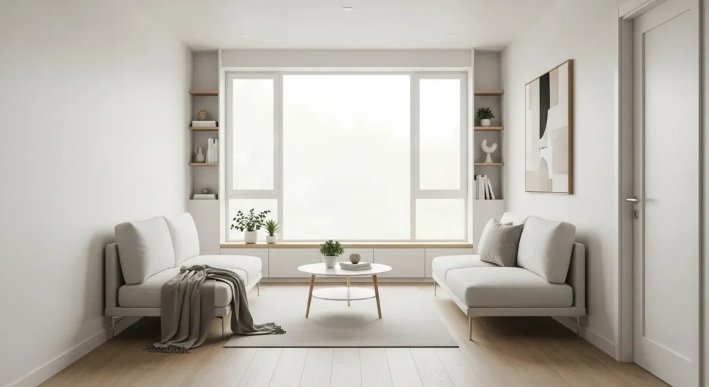
Colors That Make Rooms Feel Bigger
Small rooms need specific color strategies to feel more spacious and open.
Space-Enhancing Colors:
Light Colors: light neutrals in an airy room are proven to make spaces feel bigger and brighter.
Cool Tones: Blues and greens recede visually, making walls appear farther away.
Monochromatic Schemes: Using different shades of the same color creates visual flow.
White and Off-White: Reflect maximum light and create seamless transitions.
Colors That Make Rooms Feel Smaller:
- Dark colors (absorb light)
- Warm colors (advance toward you)
- High contrast combinations
- Multiple bold colors
Common Color Psychology Mistakes to Avoid
Using Too Much of One Color
Even good colors can overwhelm when used excessively. Balance bold colors with neutrals.
Ignoring Natural Light
Colors look different in various lighting conditions. Test paint samples in morning, afternoon, and evening light.
Following Trends Over Function
Choose colors based on how you want to feel in each space, not just current trends.
Forgetting About Flow
Colors should transition smoothly from room to room for a cohesive home feeling.
Also Read: 15 DIY Wallpaper Hacks That Save You $500+ (Beginner Guide)
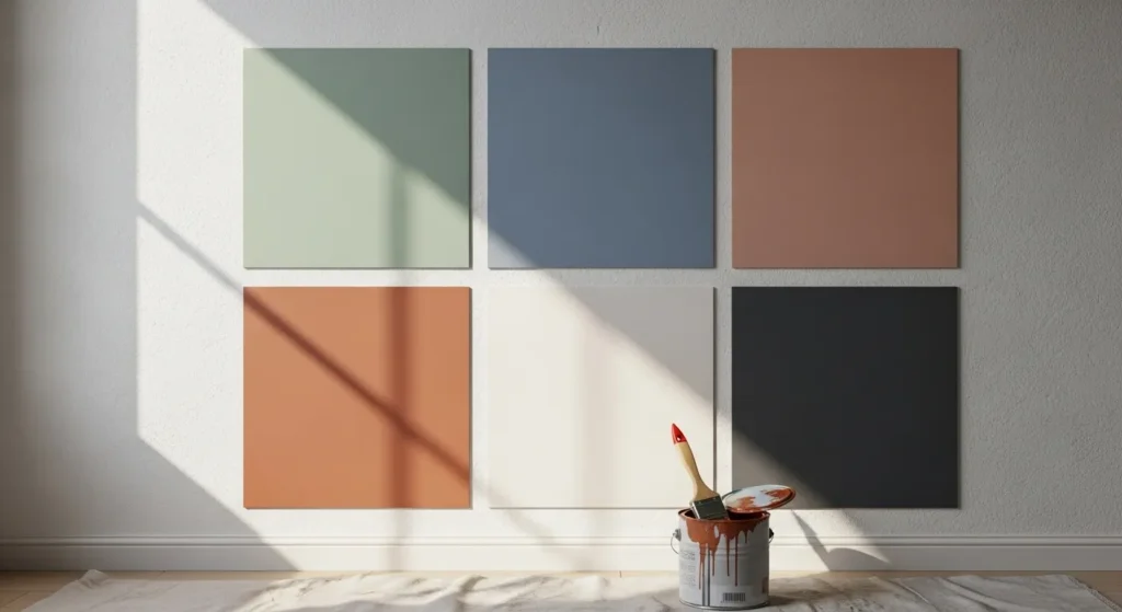
How to Test Colors Before Committing
Sample Testing Process
- Buy small paint samples of your top 3 color choices
- Paint large swatches (at least 2 feet by 2 feet) on different walls
- Observe colors at different times of day
- Live with samples for at least one week
- Notice how colors make you feel during daily activities
Consider Your Home’s Architecture
- Traditional homes often suit classic color palettes
- Modern homes can handle bold, contemporary colors
- Open floor plans need cohesive color flow
Practical Tips for Implementing Color Psychology
Start Small
If you’re nervous about color, start with accessories like pillows, artwork, or plants before painting walls.
Use the 60-30-10 Rule
- 60% dominant neutral color
- 30% secondary color
- 10% bold accent color
Consider Color Temperature
Warm undertones work better in north-facing rooms, while cool undertones suit south-facing spaces.
Layer Different Shades
Use various tints and shades of your chosen color for depth and interest.
Budget-Friendly Ways to Add Color Psychology
You don’t need a complete renovation to benefit from color psychology:
Low-Cost Color Updates:
- Paint one accent wall
- Add colorful throw pillows and blankets
- Incorporate plants for natural green
- Hang artwork in mood-boosting colors
- Use colorful lampshades for ambient lighting
Medium-Cost Updates:
- Paint all walls in a room
- Replace window treatments
- Add area rugs in strategic colors
- Update light fixtures
Seasonal Color Adjustments
Your color needs may change with seasons:
Winter: Add warm colors through textiles and accessories to combat seasonal depression.
Summer: Incorporate cool blues and greens to create a refreshing escape from heat.
Spring: Fresh yellows and light greens mirror nature’s renewal.
Fall: Rich oranges and warm browns create cozy autumn feelings.
Color Psychology for Different Family Members
Children’s Rooms
- Soft pastels promote better sleep
- Avoid overstimulating bright colors
- Use educational color combinations
Teen Spaces
- Allow personal color expression
- Balance bold choices with calming neutrals
- Consider study area color needs
Adult Bedrooms
- Prioritize relaxing, intimate colors
- Consider romantic warm tones
- Avoid work-related color associations
Maintaining Color Balance Throughout Your Home
Create a cohesive color story that flows from room to room while serving each space’s unique function. Use a consistent neutral base with room-specific accent colors.
Conclusion
Color psychology gives you the power to create a home that truly supports your daily life. By understanding how different colors affect your mood and behavior, you can design spaces that help you sleep better, feel more energetic, and enjoy time with family.
Remember that personal preference still matters. Use these guidelines as a starting point, but trust your instincts about colors that make you feel good. The best color choices are ones that reflect your personality while serving your practical needs.
Start with one room and experiment with the colors that appeal to you. Pay attention to how different hues make you feel throughout the day, and adjust as needed. Your home should be a place where every room supports your wellbeing and happiness.


Leave a Reply